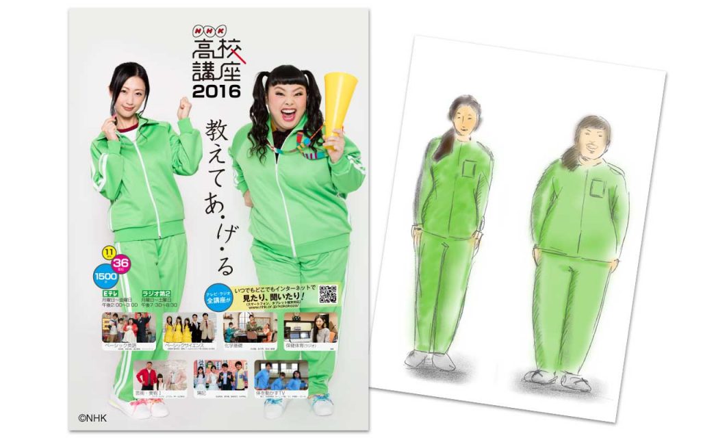
新年度へ向けて2016年用の高校講座PR用ポスターデザインと撮影を手伝わさせていただきました。主なデザインコミュニケーションは前年度と同等、代弁者が簡潔にメッセージを投げかける論法です。
このお話をいただいたときには、すでに出演者が決定していました。制作のあまりに大胆な戦法に感心しつつ、ひとつの紙面にこのお二人を同居させるイメージが全く沸きませんでした。しかし、さらに制作のお二人にはジャージを着てもらってというアイデアで一気にイメージ化することができました。基本は去年のデザインを踏襲して写真に合わせて調節というアプローチです。
お忙しいお二人なので、撮影は別の日に別の場所。後で合成をする前提での撮影でしたので、影の落ち方に注意しつつ現場で最初に撮影した写真と見比べながら行いました。そしてお二人ともさすがです。表情をいただくまでにかかる時間まで数秒とかかりません。お二人とも非常に気さくで楽しい方々でした。
壇蜜さんは高校講座 保健体育の先生
渡辺さんは高校講座 英語の団長(?)
で出演されています。
Design and Photography for Kokokoza’s 2016 Poster
Before the start of the New Year I went to Kokokoza and helped the PR course with the photography and design for their 2016 poster. The main reason for this design communication was to have a similar theme as the previous year’s poster, someone promoting a message.
NHK had already decided on the cast and I was surprised because the two ladies don’t really fit NHK’s image. However, the more I worked with them I understood NHK’s decision to cast the ladies. I was a little confused about how to design the poster, but someone on the shoot suggested that they both wear a jersey and that inspired me to create this sketch. After analyzing last year’s poster, I decided to follow a similar approach for the 2016 poster design and just add a few tweeks.
Since the two ladies had busy schedules, we had to organise two separate photoshoots in different locations. To make it seem as though they were both in the same photo, I had to remember the lighting I used for the first shoot and constantly compare each photograph; this made it easier for when I had the edit both images. It takes more than a few seconds to capture a great image, yet as both ladies were very fun and friendly to work with, it was easy to get take these photos as they had great facial expressions.
Health and Physical Education teacher – DanMitsu
Watanabe’s Head English teacher
